Visual Development
Excited about my concept, I decided to put together a mood board to help influence the visuals of the film.

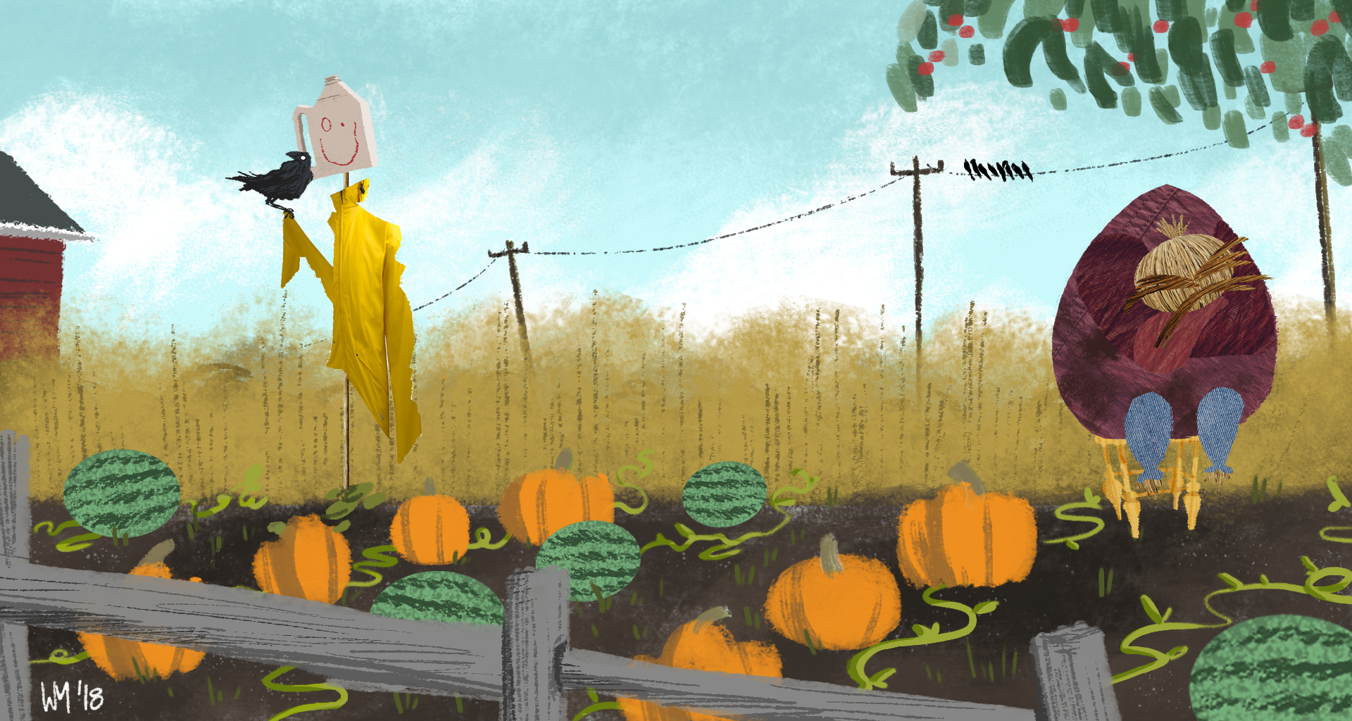
Characters were next. So far, I'm happy with how their designs are coming along, but I think the toughest part is the colors. I want them to stand out, but I also want them to feel like they're a part of this world.
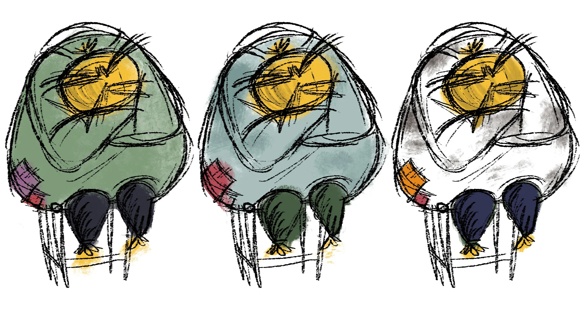

Finally I settled on these. I think your typical bright yellow raincoat fits Maurice's energetic personality. As for Lump, I added some purple to this burgundy color, just to help contrast his body from his face.

I have also been thinking about what mediums would work best for the story. While I think a rough 2D approach would fit the "messy" look of the farm and it's characters, I couldn't help but think of Stop-motion or paper cut outs. I believe these collage designs help make the characters feel like a farmer made them in his free time one day.
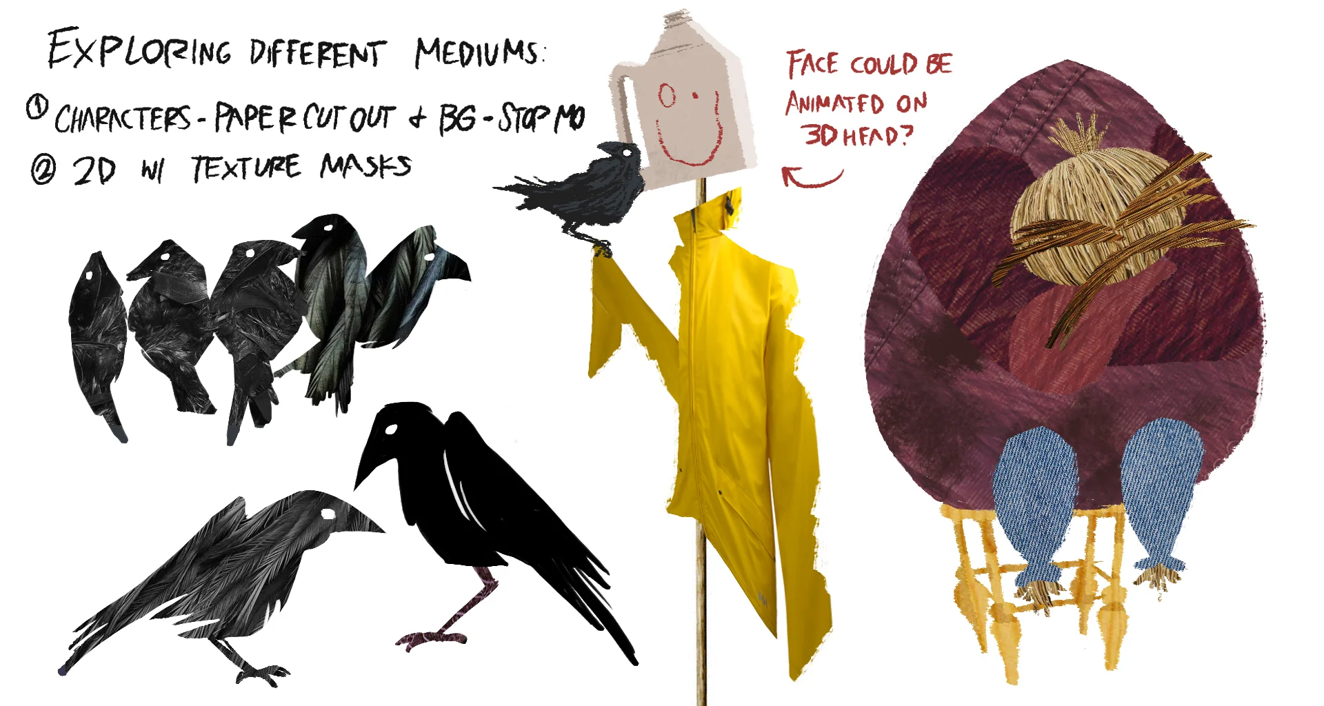
This quarter, I brought back "The Art of the Incredibles" from home. After studying it, I fell in love with some of Teddy Newton's collage work as well as Lou Romano's color script for the film. While at first both approaches may seem simple, a closer look reveals so much to be said about the story and characters. For instance, the shy teenager violet, is nothing but a dark trapezoid over some denim and sneakers. That one really stuck with me. Influenced by these artists, I tried to explore that with my own themes and concepts.